

CMYK Plastic Card Printing Explained
Most of our membership cards and full colour plastic cards are printed using the CMYK process — the standard colour method used in commercial printing worldwide.
Understanding how it works will help you prepare your artwork correctly and avoid surprises when your cards arrive.
What is CMYK?
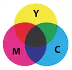
CMYK stands for Cyan, Magenta, Yellow, and Key (Black). By overprinting tiny halftone dots of these four colours in varying combinations, a wide range of colours can be reproduced — including realistic-looking photographs. The "K" is used for black rather than "B" to avoid confusion with blue.
If you look closely at any printed magazine, you'll see the individual dots rather than solid colour. This is normal and is how all CMYK printing works. It's worth noting that there is no actual green or orange ink in the process — those colours are created by layering cyan, magenta, and yellow dots in the appropriate proportions.
Because CMYK is a subtractive colour model, you start with a white surface (the card) and subtract brightness by adding ink. The more ink applied, the darker the result.
CMYK vs RGB — Why It Matters for Your Artwork
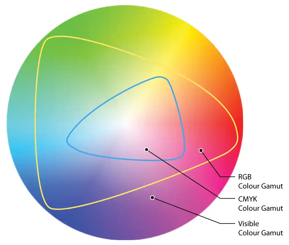
RGB (Red, Green, Blue) is the colour model used by screens — monitors, phones, tablets. It is an additive model: combining all three at full intensity produces white. RGB has a significantly wider colour range (or "gamut") than CMYK, which is why colours often appear more vivid on screen than in print.
This is the most important practical point: artwork supplied in RGB mode will not print as expected. It will need to be converted to CMYK before printing, and some colours will shift during that conversion — sometimes slightly, sometimes significantly. Bright blues, vivid oranges, and neon greens are the most commonly affected.
The one thing to take away Always supply artwork in CMYK mode. If you design in RGB and convert at the last minute, the colours you see on screen are not guaranteed to match what prints on your cards.
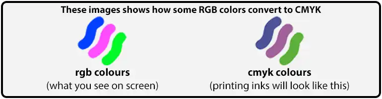
Some colours that a monitor can display simply cannot be reproduced in CMYK — these are described as being "outside the CMYK gamut." When an out-of-gamut colour is converted, the printer software gets as close as possible, but there is no workaround. This is an industry-wide limitation, not something specific to us or our equipment.
To avoid issues, set your document to CMYK mode from the outset in whatever software you're using (Adobe Illustrator, Photoshop, or InDesign). Don't design in RGB and convert at the end. There is more on this in our guide to CMYK versus RGB.
Printing Greys
Grey deserves a specific mention because it's a common cause of unexpected results. A grey made up of C0% M0% Y0% K20% (pure black ink at reduced opacity) will show visible dots when printed. A much smoother result is achieved by using a mixed CMYK grey — a balanced percentage across all four channels. If your design uses grey backgrounds or text, ask us and we can advise the right values for the shade you're after.
CMYK Black
Black should be set to C0% M0% Y0% K100% for any aspects that are black. Files that are in RGB colour mode — when converted to CMYK — will have a black as C75% M68% Y67% K90%, which if set for a large area or the background of a card will result in a muddy looking brown colour. If it is used for small text the text will not be sharp as it is made up of a % of each of the 4 CMYK colours.
Resolution and DPI
DPI stands for dots per inch and describes image resolution. For plastic card printing, all raster images (photographs, backgrounds, non-vector graphics) must be supplied at a minimum of 600 DPI at the finished print size.
Images downloaded from the web are typically 72 DPI — far too low for print. They may look fine on screen but will appear noticeably blurry or pixelated when printed. If your image looks slightly soft on screen at 100% zoom, it will look significantly worse on the card.
You cannot fix a low-resolution image by increasing the DPI setting in Photoshop without resampling — this adds pixels artificially and does not recover detail that wasn't there to begin with. If in doubt about image quality, contact us before finalising your artwork. There is a worked comparison on our resolution example page.
File Types: Raster vs Vector
There are two fundamental types of graphic file:
- Raster files (JPEG, PNG, TIFF, PSD) are made up of pixels. Quality is fixed at the resolution they were created at. Suitable for photographs, but must be 600 DPI at print size.
- Vector files (AI, EPS, PDF from Illustrator) are built from mathematical paths and scale to any size without any loss of quality. Ideal for logos, text, and graphic elements.
We prefer artwork supplied as a high-resolution PDF, AI, or EPS. If your file contains live text, make sure all fonts are outlined (converted to curves) before supplying. This prevents text from reflowing or being substituted if we don't have your exact font installed.
JPEG files are generally not recommended for print due to compression artefacts, though they are acceptable for photographs if supplied at 600 DPI. Word documents are not suitable for print production. Our page on raster versus vector images goes into more detail.
Pantone (PMS) Colours
Pantone (PMS) colours are pre-mixed spot inks that fall outside the standard CMYK process. They're used when absolute colour accuracy is critical — for example, matching a specific brand colour exactly. Pantone also covers metallic, neon, and pastel inks that cannot be replicated in CMYK.
Our full colour plastic cards are printed in CMYK. We do not print with Pantone inks and we do not match to Pantone colours. If your brand uses a Pantone colour, it is converted to the nearest CMYK equivalent, which can be close but is never the exact shade, and printing on plastic and bonding clear PVC over the print shift it slightly again. If the colour has to be right, order a postal proof and check it on a real printed card before the full order is printed. Our page on Pantone colours and plastic cards explains why.
Artwork Checklist
Before supplying your artwork, run through this checklist:
- Document set to CMYK colour mode (not RGB).
- All images at 600 DPI minimum at finished print size.
- All fonts outlined / converted to curves.
- 3mm bleed on all sides beyond the card edge, so the artwork file is set up at 92mm × 60mm.
- All important content kept 3mm inside the card edge (safe zone).
- File supplied as PDF, AI, or EPS.
- All black set to C0% M0% Y0% K100% for both large areas and small text.
Full artwork specifications and downloadable templates are available on our artwork guides page, and our artwork setup guide walks through bleed and safe zones with a diagram.
Any Questions About Your Artwork?

Contact our team — we're happy to help before you finalise your files. If a colour is going to shift badly in conversion, or an image is too low-res to print cleanly, you will hear it from us at the start rather than at proof stage.
Every full colour order gets a free photorealistic email proof. If you’d like to see how the colours land on real plastic first, add a postal proof for £65 +vat: a few cards printed on the production presses and posted to you before the full run.
CMYK versus RGB, how to set up your artwork, or have us check and fix your artwork for £10+vat. Or browse the full range of card types.