
Pantone Colours: Why We Don't Match Them on Plastic Cards
We print every full colour plastic card in CMYK, the four process inks: cyan, magenta, yellow and black. We don't print with Pantone inks, and we don't match to Pantone colours.
CMYK can imitate a Pantone colour, and for many colours the result is close. It is never the exact shade. On a plastic card the colour then moves twice more: once because it is printed on plastic instead of paper, and again when the printed sheet is bonded between clear PVC sheets. Each shift is small, but together they make colour matching a nightmare, so we don't promise it.
The short versionSend your artwork in CMYK. If a colour has to be right, order a postal proof and approve a real printed card before the full order goes on press.
What Pantone colours are
Pantone is a numbered colour system. Each Pantone colour, such as 186 C or 300 C, is an ink mixed to a set recipe before it goes on the press and printed as a solid colour of its own. Printers call it a spot colour. Brand guidelines often give a logo colour as a Pantone number for that reason: any printer who prints with Pantone inks can mix the same colour.
CMYK is built differently. There is no ink mixed for your logo colour. Every colour on the card is made on the press from tiny dots of the four process inks printed over each other, and the eye blends the dots into the colour you see.
Pantone's swatch books are printed on paper. The C after a Pantone number means coated paper and the U means uncoated, so the colour you pick from the book is a colour on paper. That matters for step 2.
1Pantone to CMYK: close, never exact
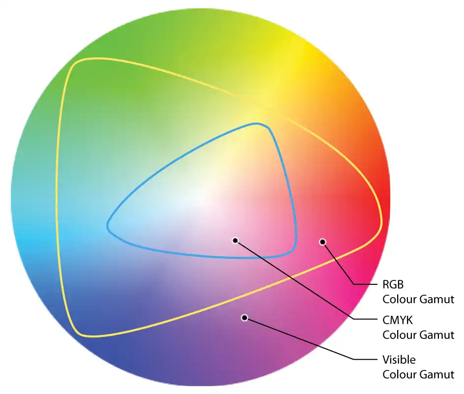
Before your cards are printed, every Pantone colour in the artwork is converted to a mix of the four CMYK inks. Pantone publishes CMYK versions of its colours for exactly this, and for many colours the CMYK version is a close match.
Some colours move more than others. A Pantone ink can be mixed to colours that four process inks cannot reach, and those colours are printed as the nearest colour CMYK can make. In the diagram, the blue line is the edge of what CMYK ink can print.
- Bright oranges, vivid greens and blues, and strong purples shift the most.
- Fluorescent and metallic Pantone colours cannot be printed in CMYK at all. The nearest CMYK mix looks flat beside them.
- Darker and more muted colours usually convert closely.
Our terms and conditions (section 8.5) say the same thing: files that arrive with Pantone or RGB colours in them are converted to CMYK before printing, so the colours will change from how they look on your screen.
2Plastic prints differently from paper
Print the same CMYK file on paper and on plastic and the two won't match. Paper absorbs ink. White PVC doesn't, so the ink sits on the surface of the plastic. The white underneath is a different white as well, and the colour printed on top of it changes with it.
So your brand colour has a second reason to drift, separate from the CMYK conversion. A Pantone swatch book, a proof from your office printer, and your letterheads or leaflets from another printer are all colours on paper. None of them is a reliable guide to how the same colour will look on a plastic card.
3The clear PVC shifts it again
We print the cards 21 to a sheet. The printed sheets are then bonded with heat and pressure between clear PVC sheets, which takes them up to their 760 micron thickness and gives them their finish. Only then are they cut to size.
Everything you see on a finished card is seen through that clear PVC layer, and the layer changes the colour slightly again. High Gloss makes colours look deeper and more vibrant. Premium Matt softens and dulls them a little. The same artwork, printed on the same day, looks different in the two finishes.
If the colour matters, choose your finish before you approve the artwork. Our guide to High Gloss v Premium Matt shows the difference between the two.
Getting as close as possible
We can't promise a Pantone match, but you can get close and see the result on a real card before the full order is printed.
- Set your artwork up in CMYK. Give your brand colours as CMYK values. If all you have is a Pantone number, use Pantone's own CMYK version of it, or send the Pantone number and we'll convert it for you.
- Don't judge the colour on a screen. The free photorealistic proof we email you is for checking the layout, text and spelling. Every screen shows colour differently, so it can't show you the printed shade.
- Order a postal proof if the colour has to be right. We print a few real cards on the production presses, bonded and cut to size, and post them to you. You approve the colour on an actual card. The first postal proof is £65 +vat, a revised one is £35 +vat, and it adds around 5 working days.
- Hold a sample. A sample pack has cards printed in both finishes, so you can see how our CMYK printing looks on plastic under your own lighting.
Worth knowingA postal proof shows you the colour your cards will print in. It doesn't turn that colour into a Pantone match. If the proof is too far from what you want, adjust the CMYK values in the artwork and order a revised proof.
Questions & Answers
-
Do you print Pantone colours?
No. All our full colour plastic cards are printed in CMYK. We don't print with Pantone inks and we don't match to Pantone colours.
-
Can you get close to my Pantone colour?
Often, yes. Many Pantone colours have a close CMYK equivalent. Bright oranges, vivid greens and blues, and strong purples move the most, and fluorescent and metallic Pantones can't be printed in CMYK at all.
Close is as far as it goes: the printed colour won't be the exact Pantone shade.
-
What happens if my artwork has Pantone colours in it?
We convert them to CMYK before printing, the same as we do with RGB colours, so expect the colours to change from how they look on your screen.
If you'd rather choose the CMYK values yourself, convert the file before you send it. Our page on CMYK vs RGB explains how.
-
Why does my plastic card look different from my printed leaflets?
Because the leaflets are printed on paper. The same CMYK artwork prints differently on plastic, and the clear PVC over the print changes the colour slightly again.
-
Does a gloss or matt finish change the colour?
Yes, slightly. High Gloss makes colours look deeper and more vibrant, and Premium Matt softens them.
Choose the finish before you approve the artwork, so the colour is judged on the surface it will be printed on.
-
How can I check the colour before my order is printed?
Order a postal proof. We print a few real cards on the production presses, bonded and cut to size, and post them to you to approve. The first postal proof is £65 +vat and a revised one is £35 +vat.
The free email proof is for checking layout and text, not the exact colour, because every screen shows colour differently.
-
Are hot foil cards matched to Pantone colours?
No. Our translucent, white, satin black and metallic cards are printed with hot foil, chosen from a fixed range of 42 metallic and pigment foils.
Some foil colours are listed with an approximate Pantone reference to help you choose, but the foils aren't mixed or matched to a Pantone colour. See the ink and foil range.
Ready to order?

Every full colour order comes with a free photorealistic proof before we print, so you can check the layout and wording before anything goes on press.
If a colour has to be right, ask for a postal proof when you request your quote, and you'll approve a real printed card first.