


CMYK vs RGB — Why It Matters for Plastic Card Printing
RGB is for screens. CMYK is for print. If you send RGB artwork to a card printer and nobody catches it, the colours that come back on your finished cards will be wrong — sometimes dramatically so.
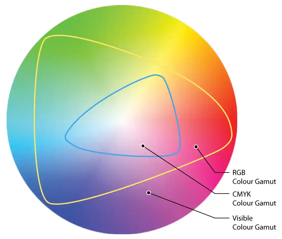
That vivid neon blue on your monitor? It cannot be reproduced in CMYK ink. You will get a duller, different shade. The sooner you convert your file to CMYK and proof it, the fewer surprises you get.
What RGB actually is
RGB stands for Red, Green, Blue. It is an additive colour model — screens mix light to create colours, and combining all three at full intensity gives you white. It has a much wider colour gamut than print, meaning it can represent colours that physically cannot be reproduced with ink on a substrate.
What CMYK actually is
CMYK stands for Cyan, Magenta, Yellow, Key (Black). It is a subtractive model — ink absorbs light rather than emitting it. Mixing all four inks produces a dark brown-black in theory; that is why a separate black (K) ink exists for clean, dense text and solid dark areas.
Plastic card printers — whether offset litho or digital — print in CMYK. Your artwork needs to be in this mode before it goes on press.
What goes wrong with RGB files
- Colours shift on output, especially saturated blues, greens, and oranges
- Brand colours can drift significantly. A Pantone-matched corporate blue can look purple or grey
How to convert correctly
Adobe Illustrator or InDesign: go to Edit > Colour Settings, set your working CMYK profile (usually ISO Coated v2 or FOGRA39 for European print), then convert your document colour mode to CMYK.
Photoshop: Image > Mode > CMYK Colour. Do this before you start laying out artwork, not at the end — converting after the fact changes how every colour looks on screen.
Canva and similar browser tools: most do not give you true CMYK control. Export as a high-resolution PDF and check with your printer whether their workflow handles the conversion, or use a proper design tool.
Spot colours and Pantone
We print in CMYK not spot or Pantone colours. It is not possible to accurately match to Pantone colours. If brand colour accuracy is critical, add a postal proof to your order.
Our page on Pantone colours and plastic cards explains why, and the three places the colour shifts between your artwork and the finished card.
More on CMYK printing, how to set up your artwork, or what file format to send. Or have us check and fix your artwork for £10+vat, or browse the full range of card types.