

How to Design a Loyalty Card
A well-designed loyalty card does two jobs at once: it reinforces your brand every time a customer pulls it out of their wallet, and it is functional enough that staff can actually use it.
Get the design wrong and you end up with cards that look cheap, scan incorrectly, or come back from print looking nothing like you expected. This guide covers everything you need to know before you send artwork to a printer — and you can see our loyalty card printing options alongside it.

Setting the Artwork Up
Four things decide whether a file is printable at all: size, resolution, bleed and safe zone.
Start With the Right Size
The vast majority of loyalty cards are printed to CR80 size — 86mm × 54mm, identical to a standard bank card. This is not arbitrary: it fits every wallet, card holder and card slot your customers already own.
Some businesses opt for the slightly smaller CR79 size, which works with certain card holders that grip the card by the edges. Unless you have a specific reason, stick with CR80 — our page on CR80 versus CR79 covers the difference.
What to avoid Designing at the wrong size and then scaling the artwork up or down to fit. That distorts everything on the card.
Set Up at the Correct Resolution
Print is not screen. An image that looks sharp on a monitor at 72dpi will look blurry on a printed card. Loyalty card artwork should be supplied at a minimum of 600dpi at actual print size.
Vector files (AI, EPS, PDF) are ideal because they are resolution-independent — your logo will be crisp at any size. If you are working with raster images (JPEG, PNG, TIFF), make sure they are 600dpi at 86 × 54mm, not scaled up from a smaller file. There is a worked comparison on our raster versus vector page.
Common mistake Exporting a design from Canva at screen resolution and wondering why the printed card looks soft. Always export at 600dpi minimum, or ask your printer for a template file.
Include a Bleed Area — and a Safe Zone
Printing is not millimetre-perfect. Cards are printed on larger sheets and then cut down to size, and there is always a small margin of movement in the cutting process. If your background colour or design runs right to the edge of the card, you need to extend it slightly beyond that edge. The extension is called the bleed.
Standard bleed for plastic card printing is 3mm on all sides, so your artwork file should be 92mm × 60mm, not 86 × 54mm. Without bleed, a solid colour or patterned background can end up with a thin white border on one or more edges. It looks unprofessional, and there is nothing the printer can do about it once the cards are cut.
The flip side is the safe zone. Anything you do not want cut off — your logo, your business name, any text — should sit at least 3mm inside the card edge. Designs that push logos or text right to the edge look precarious on screen and often get partially cropped in print. Our bleed and size page shows both drawn out.
Where the Functional Elements Go
If your loyalty card includes any of these, their position and size matter as much as the design around them.
Stamp boxes
For a stamp-based scheme — collect ten, get one free — the boxes need to be large enough to stamp clearly and spaced so they do not bleed into each other. Typical stamp circles are 10–12mm in diameter.
Which stamp inks work on plastic, and when a punch is the better choice, is covered in writing and stamping on plastic cards. For how many boxes to print and what the reward should be, see loyalty card ideas.
QR codes
The same quiet zone rules as a barcode. Minimum print size is around 20 × 20mm for reliable scanning — smaller than that and cheap phone cameras will struggle. See our QR code specifications.
Magnetic stripe
If you are having one added, it runs along the top of the back of the card when held horizontally, 13mm × 86mm. Don’t put design elements there. See magnetic stripe specifications.
Signature strip
Sits below the magnetic stripe on the back. Leave it clear of graphics, and put it on a white background — on a coloured one the panel picks up the colour behind it.
Barcodes
Barcodes need white space around them — known as the quiet zone — or scanners will not read them. Don’t run other design elements up to the barcode edge.
They also need sufficient contrast: dark bars on a light background. Never print a barcode on a dark card without inverting it to a light barcode on dark, and test the scan on your own hardware before ordering in bulk. Our barcode specifications cover Code 39, Code 128 and the rest, and every full colour order gets a printed postal proof you can scan before the full run goes ahead.
Finish, Colour and the Reverse
Three decisions that are easier to make before you design than after.
Choose Your Finish Before You Design
This matters more than most people expect. Your finish affects how the final card looks and feels — and it affects your colour choices.
- High gloss — vivid, high-shine finish. Colours look punchy and saturated. Best for bold, colourful designs.
- Premium matt — flat, premium feel. Slightly softer on colour reproduction. Better for minimal, sophisticated designs, though it shows fingerprints more than gloss.
Design for the finish you have chosen. A design that looks striking in gloss can look washed out in matt if the colours are not adjusted — there is more on our gloss and matt page.
Use CMYK, Not RGB
Screens display colour using RGB (red, green, blue). Printers use CMYK (cyan, magenta, yellow, black). The two colour spaces do not match perfectly, and some colours — particularly vivid blues, oranges and greens — shift noticeably when converted.
Set your design software to CMYK mode from the start. If you are handed a logo in RGB, convert it before building your card design around it. We print in CMYK and do not match to Pantone colours, so give any brand colour as CMYK values. If a colour has to be right, a postal proof lets you check it on a real printed card first. Our pages on CMYK versus RGB and Pantone colours explain what shifts and why.
The Back of the Card
A lot of businesses put all their effort into the front and treat the back as an afterthought. That is a missed opportunity. The back is a good place for:
- Your website or social media handle.
- Terms and conditions for the loyalty scheme — brief, and readable.
- A prompt to download your app, if you have one.
- The barcode or QR code, if you want the front completely clean.
Keep it uncluttered. A busy back looks amateur.
Get a Proof Before You Commit
Any reputable card printer will send you a visual proof before going to press. Look at it on screen, but also print it out at actual size if you can — A4 paper, scissors and a ruler. Hold it. See how it feels to look at.
Things to check on the proof:
- Does the logo look right at this size?
- Is any text too small to read easily?
- Are the stamp boxes the right size?
- Does the barcode have an adequate quiet zone?
- Is the business name spelled correctly?
Worth knowing An obvious point, but artwork errors that get approved on the proof are your responsibility, not the printer’s. Ask a colleague to read it through as well.
Common Mistakes, Summarised
Six faults account for nearly every loyalty card file that has to go back for correction.
Screen resolution, not print
Artwork supplied at 72dpi instead of 600dpi. It looks fine on the monitor it was made on and soft on every card.
No bleed
Thin white borders along one or more edges after cutting, and nothing anyone can do about it once the cards are cut.
RGB colour mode
Colours shift on conversion to CMYK — vivid blues, oranges and greens most of all.
Logo or text in the cut zone
Anything closer than 3mm to the edge risks coming back partially cropped.
Barcode too close to other elements
Without its quiet zone, the barcode fails to scan — and you find out after the full run is printed.
Designing for gloss, printing in matt
Or the reverse. Choose the finish first and adjust the colours to it.
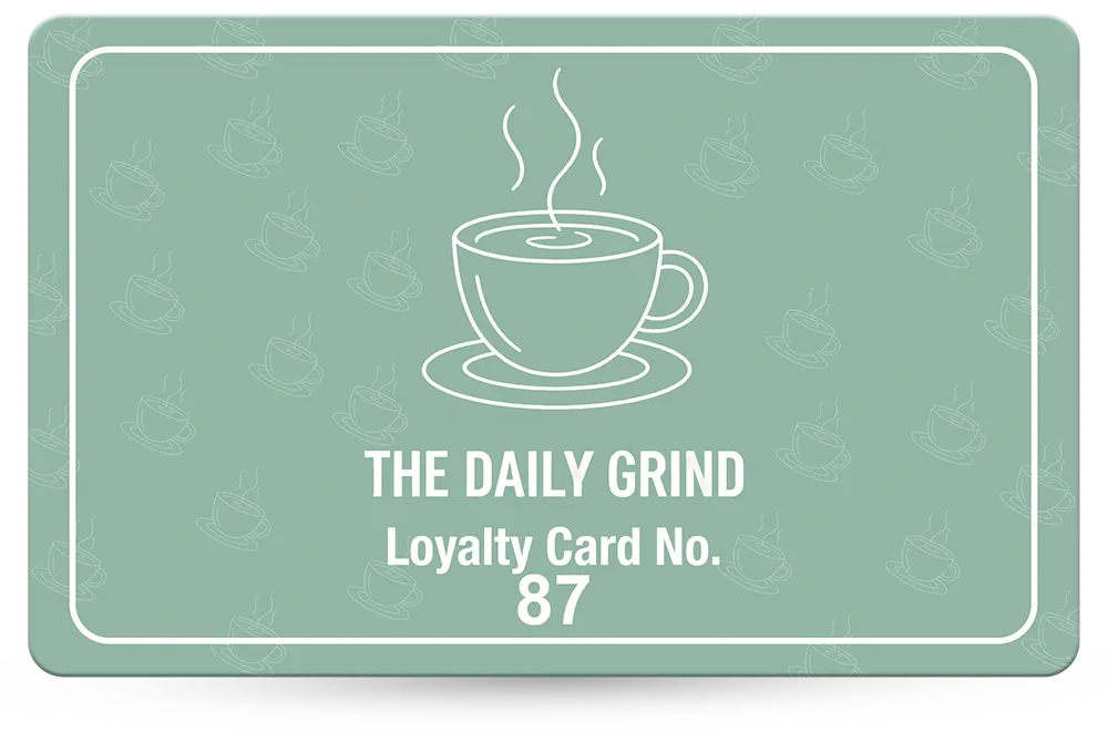
Loyalty Cards We Have Printed
A few designs from the full gallery, across a range of trades.


Questions & Answers
-
What size should a loyalty card be?
CR80 — 86mm × 54mm, identical to a standard bank card, so it fits every wallet and card holder your customers already own. A slightly smaller CR79 is available for holders that grip the card by its edges; unless you have a specific reason, stick with CR80. See CR80 versus CR79. -
How much bleed does a loyalty card need?
3mm on all sides, so the artwork file should be 92mm × 60mm rather than 86 × 54mm. Without it, a solid or patterned background can end up with a thin white border after cutting. Our bleed and size page shows it drawn out. -
How big should stamp boxes be?
Typical stamp circles are 10–12mm in diameter. They need to be big enough to stamp clearly and spaced so one stamp does not bleed into the next. -
Why will my barcode not scan?
Almost always the quiet zone or the contrast. Barcodes need white space around them, and dark bars on a light background — never a dark barcode on a dark card without inverting it. Test the scan on your own hardware before ordering in bulk; the printed postal proof is there for exactly that. See our barcode specifications. -
How small can a QR code be?
Around 20 × 20mm is the practical minimum for reliable scanning. Smaller than that and cheaper phone cameras will struggle. QR codes need the same quiet zone as a barcode — more on our QR code page, and on QR code versus barcode. -
Does the card finish affect the colours?
Yes. High gloss is vivid and high-shine, and colours look punchy and saturated. Premium matt is flatter and slightly softer on colour reproduction. A design that looks striking in gloss can look washed out in matt if the colours are not adjusted, so choose the finish before you design — see gloss and matt.
Ready to Print?

If you want to take the guesswork out of it, our design service starts at £29+vat. If you already have artwork ready, send it over for a quote and we will tell you what it needs before you commit to anything.
We print loyalty cards in England, with free UK delivery and a minimum order of just 25 cards. Every full colour order gets a free photorealistic email proof, and if you want to scan the barcode on your own hardware first, you can add a postal proof for £65 +vat: a few real cards posted to you before the full run is printed.
See our loyalty card printing page for specifications and prices, read how to add a barcode to a loyalty card, work out how many loyalty cards to order, or compare digital and plastic loyalty cards.