


How to Design a Plastic Business Card
A plastic business card is often the first physical impression someone has of your business. Get it right and it reinforces your brand, feels premium in the hand, and gets kept rather than binned.
Below is a practical guide to designing an effective plastic business card — branding, layout, and the print-specific requirements that catch people out.

Designing the Card
The decisions that make the difference between a card someone keeps and a card someone bins.
Understand Your Brand Identity
Before opening any design software, be clear on your brand. Your business card should be consistent with your website, signage and other marketing materials — same colours, same fonts, same overall feel. A card that looks disconnected from your other branding undermines both.
Think about the impression you want to create. A solicitor’s card should feel different to a photographer’s card. Let your industry and personality guide the design choices, rather than copying what everyone else in your sector does.
Size and Layout
Standard plastic business cards are 86mm × 54mm — the same as a credit card. This is the CR80 format and is what we print as standard. It fits neatly in wallets and cardholders, which matters more than people realise: a card that doesn’t fit gets left behind.
Decide early whether you want a landscape or portrait layout. Portrait cards are less common and can stand out for the right type of business. Whatever orientation you choose, make the hierarchy of information logical — your name and company should be the first thing the eye lands on, with contact details secondary.
What to Include
Keep it to the essentials. A cluttered card is harder to read and looks less professional than a clean, well-spaced one. Typically you need:
- Your name and job title.
- Company name and logo.
- Phone number.
- Email address.
- Website.
If you are tempted to add more, ask whether it genuinely helps the person reading it or just fills space. A QR code linking to your website or LinkedIn profile can replace several lines of text and looks modern. Any overflow information works well on the back of the card.
Typography
Use no more than two fonts: a stronger, more distinctive one for your name or company, and a clean, readable one for contact details. Sans-serif fonts reproduce well at small sizes on plastic cards and are generally the safer choice for body text.
Keep body text no smaller than 6pt. Anything smaller becomes difficult to read, particularly on glossy cards under certain lighting. Test your design at 100% print size before committing — what looks fine on a large monitor can be uncomfortably small in print.
Before you send artwork Outline all fonts, also called converting to curves. If we do not have your font installed, text may reflow or be substituted. Outlining eliminates that risk entirely.
Colour
Use your brand colours consistently, and make sure there is strong contrast between text and background — light on dark or dark on light. Avoid placing small text over busy or gradient backgrounds, where legibility suffers.
Before you send artwork Supply everything in CMYK colour mode, not RGB. RGB is for screens; CMYK is for print. Colours that look vivid on screen in RGB can shift noticeably once converted. Set your document to CMYK from the start in Illustrator, Photoshop or InDesign — our CMYK guide goes into more detail.
Logo, Images and Graphics
Your logo should be supplied as a vector file (AI, EPS or PDF) rather than a JPEG or PNG where possible. Vector logos stay sharp at any size; raster logos can appear pixelated when scaled up. If you only have a JPEG or PNG, make sure it is at least 600dpi at the size it will appear on the card.
Position the logo prominently, but do not let it dominate the card at the expense of your contact details. Both need to be clearly visible.
The same rule applies to background images and photographs: a minimum of 600dpi at the finished print size. Images that look acceptable on screen are often far lower resolution than that, and will look noticeably blurry once printed. If in doubt, ask us before you finalise the design.
Getting the Artwork Print-Ready
This is the part that is most commonly overlooked, and getting it wrong means the artwork cannot go to print without amendments.
Bleed, Safe Zone and File Format
- Bleed — extend your background colour or design 3mm beyond the card edge on all four sides, so your artwork file is set up at 92mm × 60mm. Cards are printed on larger sheets and then cut down; bleed prevents white edges appearing if the cut is very slightly off.
- Safe zone — keep all important content (text, logos, phone numbers) at least 3mm inside the card edge. Anything closer risks being trimmed.
- File format — supply a high-resolution PDF, AI or EPS. We do not recommend Word documents or low-resolution JPEGs.
- Resolution — 600dpi minimum at finished size for any raster images or backgrounds.
Full specifications and downloadable templates are on our artwork guides page, and there is a worked diagram on our bleed and size page.
The Back of the Card
Don’t leave the back blank — it is free space that most people waste. Options include a striking full-bleed design, your tagline, a QR code, a map to your premises, or simply a cleaner repeat of your branding. The back should complement the front rather than duplicate or contradict it.
If your contact details change regularly, the back is also the sensible place for the information most likely to move, keeping the front clean and timeless.
Material and Finish
Our plastic business cards are printed on 760 micron solid PVC — significantly thicker and more rigid than a standard paper card. Choose a gloss finish for vibrant, high-impact colour, or a matt finish for a more understated, premium look and feel. Both make a strong impression against paper alternatives, and there is more on the difference on our gloss and matt page.
Common Design Mistakes to Avoid
Six faults account for nearly every business card file we have to send back.
Text too close to the edge
Always observe the 3mm safe zone. Anything closer risks being trimmed off during cutting.
RGB instead of CMYK
Colours will shift at print, sometimes significantly. Set the document to CMYK before you start designing, not afterwards.
Low-resolution images
Anything below 600dpi at finished size will print poorly, however acceptable it looks on a screen.
Fonts not outlined
Always convert text to curves before supplying artwork, or the fonts we do not have will be substituted.
Too much information
Overcrowded cards look unprofessional and are hard to read. Move the overflow to the back.
No bleed
White edges will appear after cutting if your background does not extend into the bleed area.
Proofing and Approval
Before we go to print we send you a free photorealistic email proof, so you can check the design, layout and every line of text. Review it carefully and ask a colleague to proofread it too — once cards are printed, errors cannot be corrected. Once you are happy and approve the proof, we move straight to production.
Not confident designing it yourself? Our in-house design team can create a professional business card design from your brief, your logo, or a rough idea. Find out more about our design service.
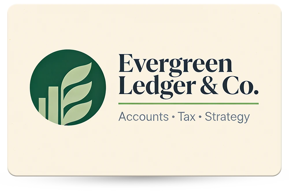
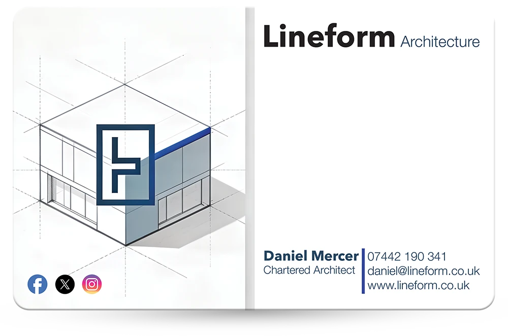
Plastic Business Cards We Have Printed
A few designs from the full gallery, across a range of trades and professions.


Questions & Answers
-
What size is a plastic business card?
86mm × 54mm, the same as a credit card. This is the CR80 format and is what we print as standard — see CR80 card size for the detail. -
How much bleed does a plastic business card need?
3mm on all four sides, so the artwork file is set up at 92mm × 60mm. Keep all important content at least 3mm inside the card edge — that inner margin is the safe zone. Our bleed and size page shows it drawn out. -
What file format should I supply artwork in?
A high-resolution PDF, AI or EPS, with any raster images or backgrounds at 600dpi at finished size. We do not recommend Word documents or low-resolution JPEGs — there is more on what file format to send. -
Should the artwork be RGB or CMYK?
CMYK. RGB is for screens and CMYK is for print, and colours that look vivid on screen in RGB can shift noticeably when converted. Set your document to CMYK from the start — our CMYK versus RGB page explains why. -
How small can text be on a plastic business card?
No smaller than 6pt for body text. Anything smaller becomes difficult to read, particularly on glossy cards under certain lighting. Print the design at 100% size and look at it before you commit. -
How thick are your plastic business cards?
760 micron solid PVC, significantly thicker and more rigid than a standard paper card. Gloss and matt are both available — see plastic card thickness.
Ready to Get Started?

Send us your artwork, or just your logo and the details you want on the card, and we will tell you what it needs before you commit to anything. If a file is too low-res or a colour is going to shift in conversion, you will hear it from us at the start rather than at proof stage.
Every full colour order gets a free photorealistic email proof, and then an actual printed card posted to you, so you can see and feel the finished article before the full run is printed. We typically reply to quote requests within 10 minutes during working hours.
See our plastic business cards for specifications and prices, check the artwork specifications, or read our guide to using AI to design your card artwork.